
Logo Again
December 14, 2013
Fifteen months ago I left you in the middle of a story. I asked for your advice and then forgot to tell you that I took it.
You may recall – if you were reading these essays then – that two years ago, when I thought I had found a location for Bread Furst, I asked Brad Ireland, a local graphic artist, to help design a logo for the bakery.
I had in mind something like what had been done for Marvelous Market and The BreadLine, a symbol, something memorable.
![]()
But Brad was thinking more evocatively about a letter-only logo, something classic, something evocative of bakeries from the early 20th Century.
I brought others into this selection process and devoted one of my early postings here to the subject. I got a lot of advice. But nearly all of it focused on what I had sent you. No one suggested a Bread Furst pictorial version – a bread, the silhouette of a baker, something like that.
I gave up. I did what Brad and Heidi (from our architectural firm) and you liked, a simple, straightforward logo.
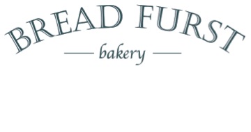
It’s clean. It’s classic. It’s minimal. It’s enough – except: I confess I am not quite satisfied. I’d rather have a carrot and sun like Marvelous Market or a faded B like The BreadLine.
But there are more important concerns now. The roof on the building we rented has to be replaced. The leaks from the walls have to be plugged. I have to raise more money.
And we really, really need our building permit as construction has come to a stop.
After all, what’s in a logo?

Mark – I think it’s perfect. It’s simple but elegant. It says what you are, no more, no less. Let the bread be your messaging. Good luck with the issues you’re dealing with.
Mark,
I rather like the one that you selected. It is simple and straighforward, but elegant, and has a good rhythm that I think people will remember.I assume that the background will be white so that the type will read .
Barbara
I like it a lot.
*From:* Bread Furst [mailto:comment-reply@wordpress.com] *Sent:* Saturday, December 14, 2013 6:01 PM *To:* marion.nestle@nyu.edu *Subject:* [New post] Logo Again
Mark Furstenberg posted: “Fifteen months ago I left you in the middle of a story. I asked for your advice and then forgot to tell you that I took it. You may recall if you were reading these essays then that two years ago, when I thought I had found a location for Bread Fu”
Hhow abut something on the order of the carrot but with a loaf of bread. A loaf with a cartoon figure pulling it or pushing it or lifting it or slicing it or something. I agree with you about the letter-only logo. It is handsome but disappointing.
Phyllis
Hi Mark,
With respect to raising money, have you considered a kick starter campaign- kick starter.com? You can promise investors goods in return for their contributions – something like a loaf of bread for every $20 or a one year membership to a loaf of the month club for $500. The fulfillment might be a headache, but companies have raised loads of capital quite successfully this way. The neighborhood is quite invested in your bakery already, let us put our money where our appetites are.
Bake on!! (Please)
Did u get ahold of mary cheh
And agree logo could be better
Aviva Kempner The Ciesla Foundation 5005 Linnean Ave, NW Washington, DC 20008 202-244-1347
rosenwaldschoolsfilm.org hankgreenbergfilm.org mollygoldbergfilm.org partisansofvilna.org
Mark,
It is unclear whether or not you are asking for more feedback on the logo. But it is worth noting that the logo in the “Logo Again” e-mail I received differs from the one that appears on the “Logo Again” blog post. In the e-mail (my preference) the two words “bread” and “furst” are separated by a space, not run together as one word (as on the blog post), and the word “bakery” is shown in lower case, not upper case (as on the blog post). Minor distinctions, perhaps, but significant just the same. Additionally, there is a third version, the one that appears at the head of the blog, my least favorite.
Thank you very much for pointing out these inconsistencies and your preferences.
Mark,
We haven’t met although my husband I (who live a block from your new space) are so anxious to see your business up and running. I recently had a logo designed for a product and it perfectly captures the name and the idea behind it. I don’t want to clutter your blog with the logo and info about the group that did the design, but if you would like for me to send it to you directly, please drop me a note.
Best regards,
Merry